Instead of listing all features, let’s see some key design decisions that set this product apart—making it more user-centric and different.
MAKING THE EXPERIENCE MORE PERSONALIZED
Filtering QR types based on business domain to simplify the selection process
Since there were a lot of many options and according to Hick’s law, we decided to categorize them based on their business type under “chosen for you.

Targeted analytics based on QR type for meaningful insights
Competitor analysis revealed that most analytics dashboards looked identical across different QR types, offering generic insights.
To enhance product differentiation, we designed dynamic analytics components tailored to each QR type, ensuring businesses get relevant, actionable insights.

CATERING BOTH KINDS OF USERS
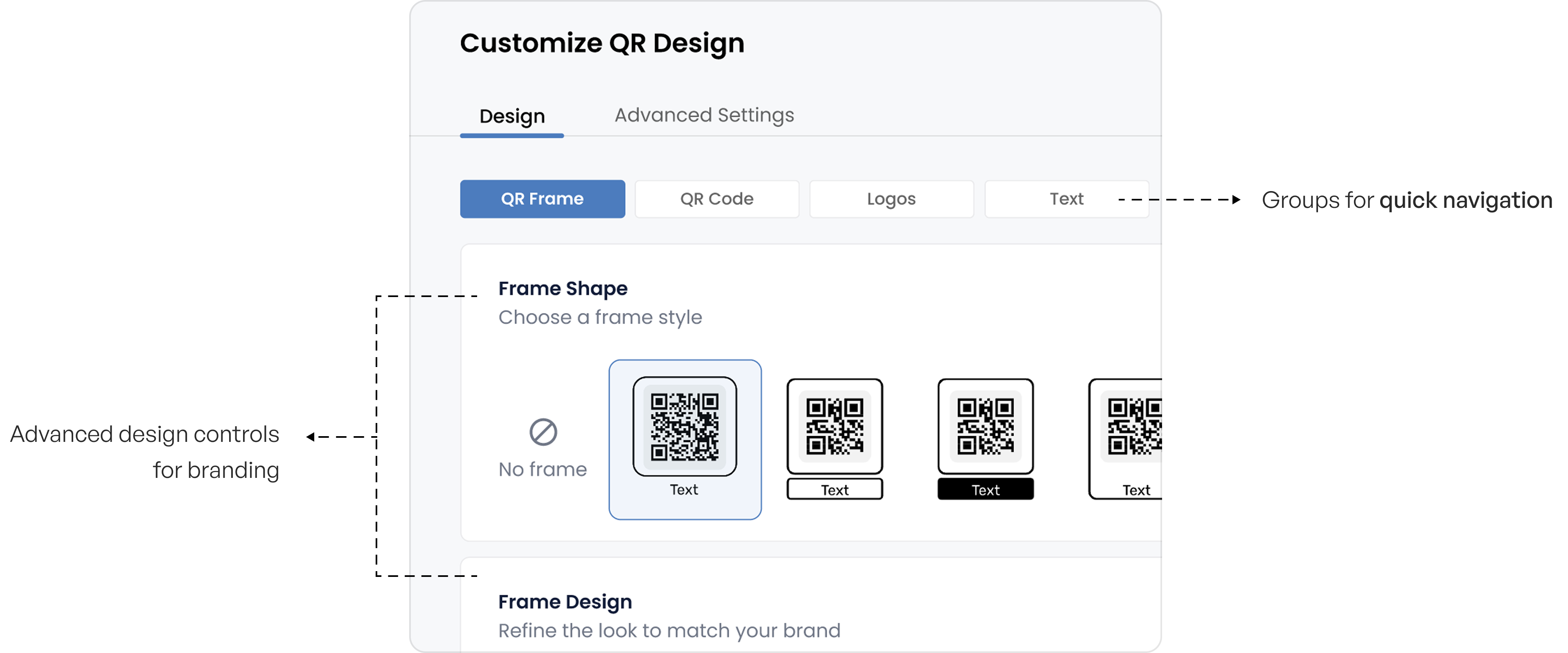
Simplifying customization with progressive disclosure, helping both tech-savvy and non-tech users navigate effortlessly
Options are grouped intuitively, with advanced settings available when needed.

Tooltips ensure users can understand settings at any time—even in advanced options
Live preview of QR and destination page to minimize errors
Competitor analysis showed the need for real-time visibility during customization.
To enhance user confidence, we introduced a live preview—allowing users to see both the QR code and its destination page instantly. This minimizes errors and ensures a seamless final output.


